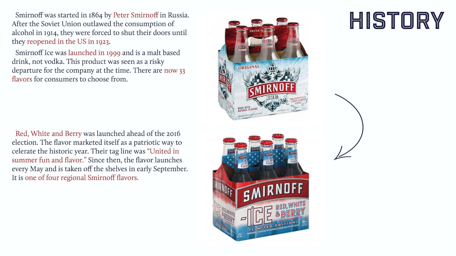
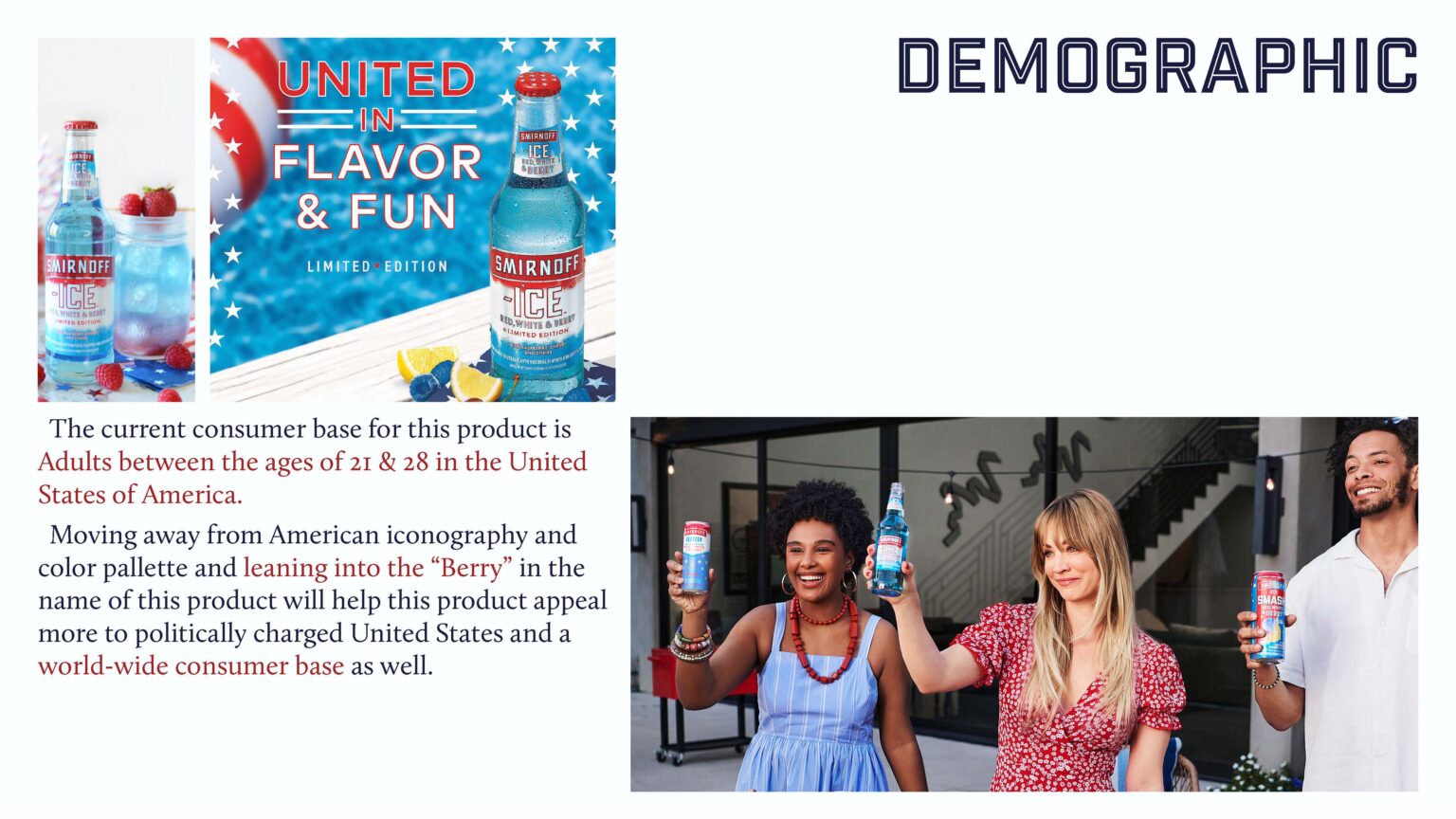
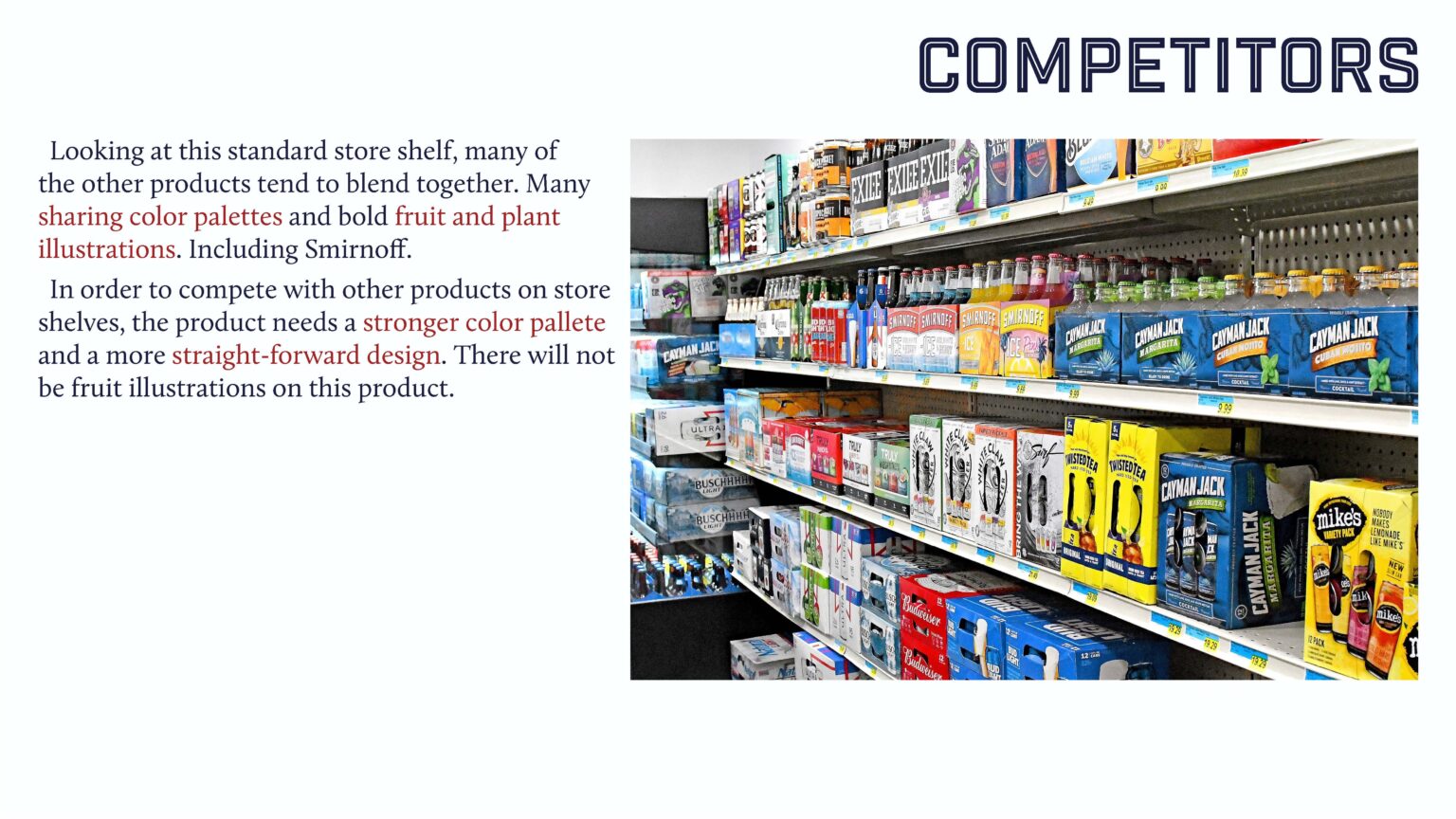
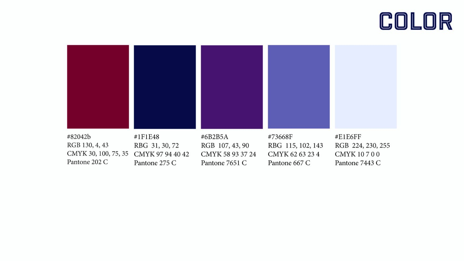
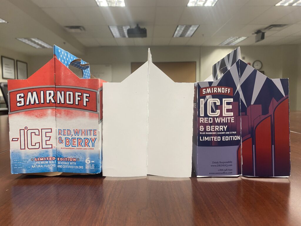
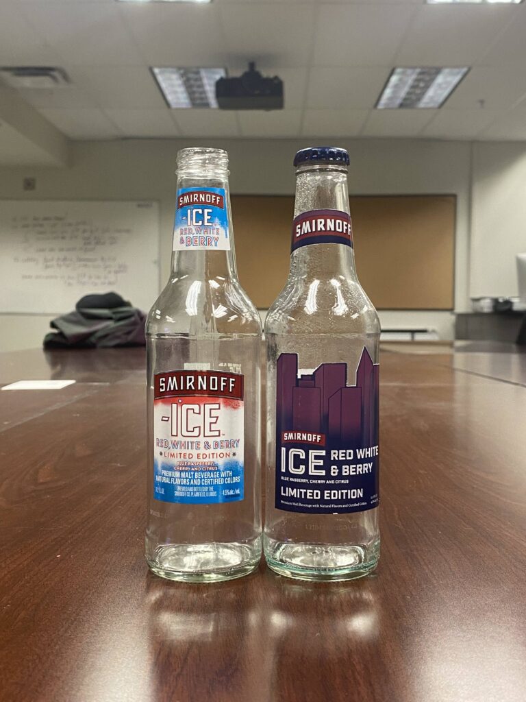
The initial brief was to redesign and existing six pack in order to appeal to a different or larger demographic. I chose the “Smirnoff ICE ‘Red White & Berry.'” I decided to move away from traditional American Iconography and colors in order to appeal to a more global audience.
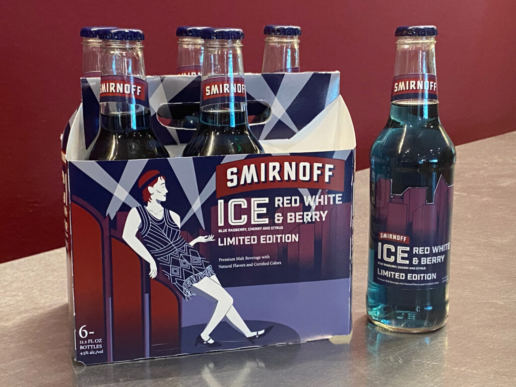
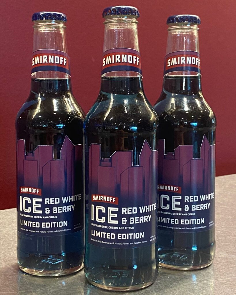
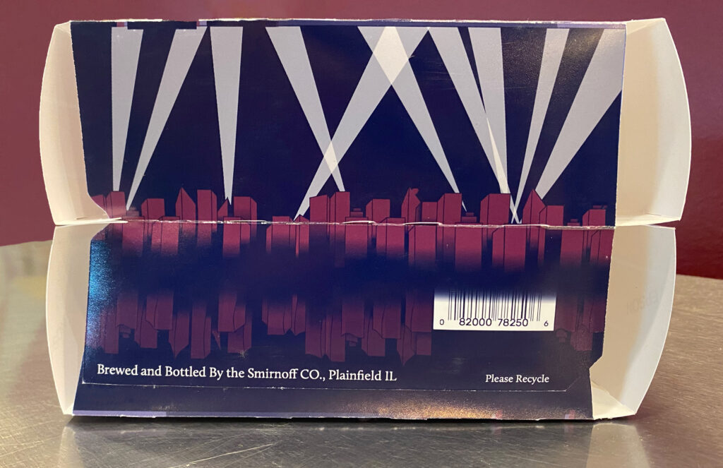
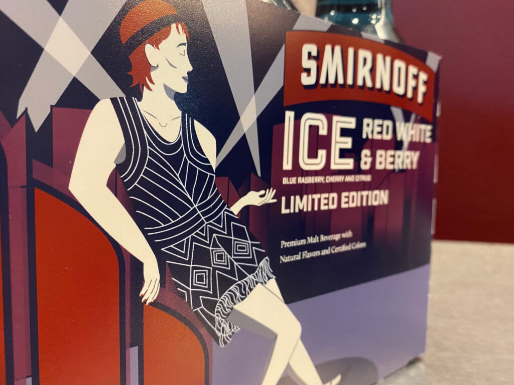
This project was built from the ground up: from research, to prototyping and finally to product photography.
